Ākina
Branding
Environmental Graphics
Print
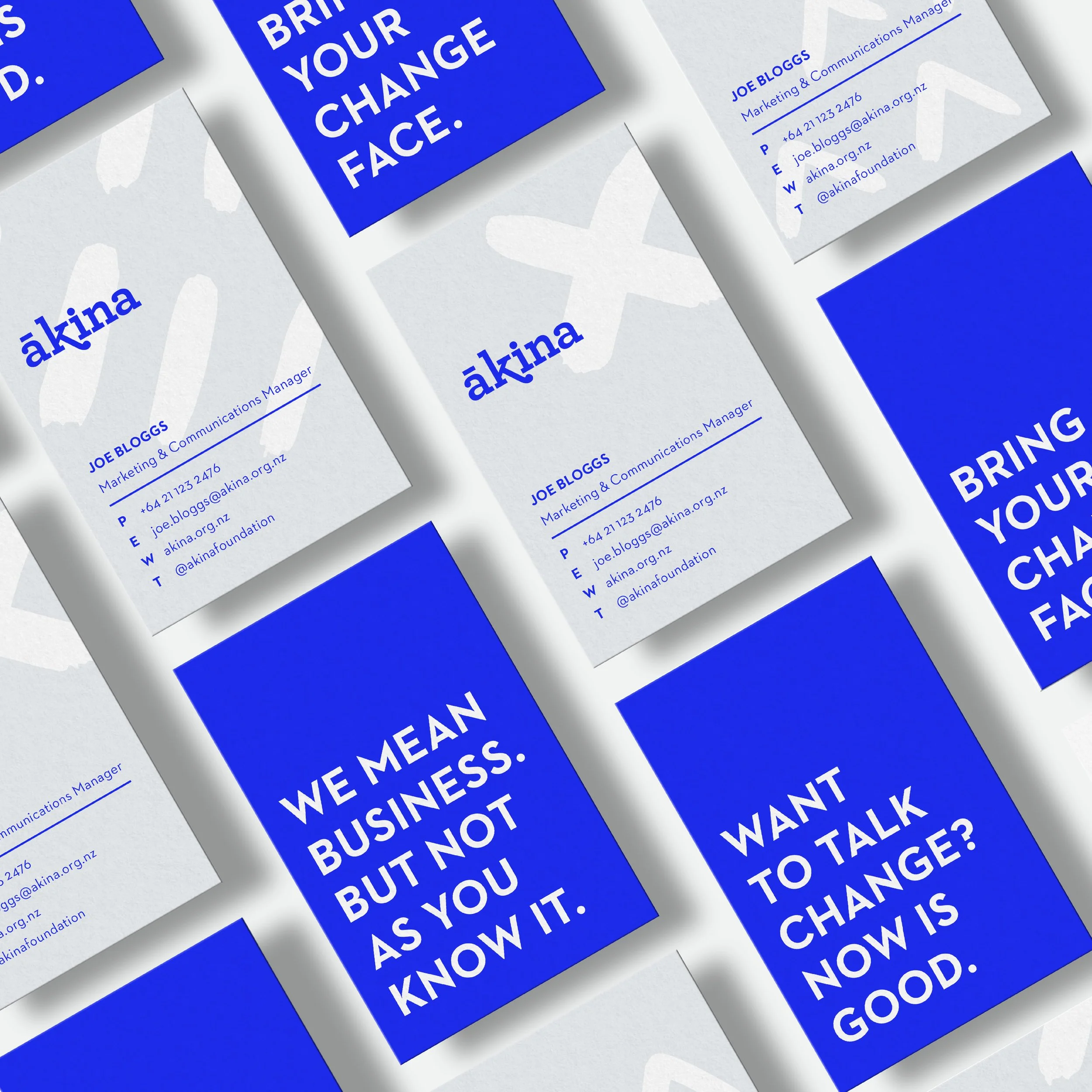
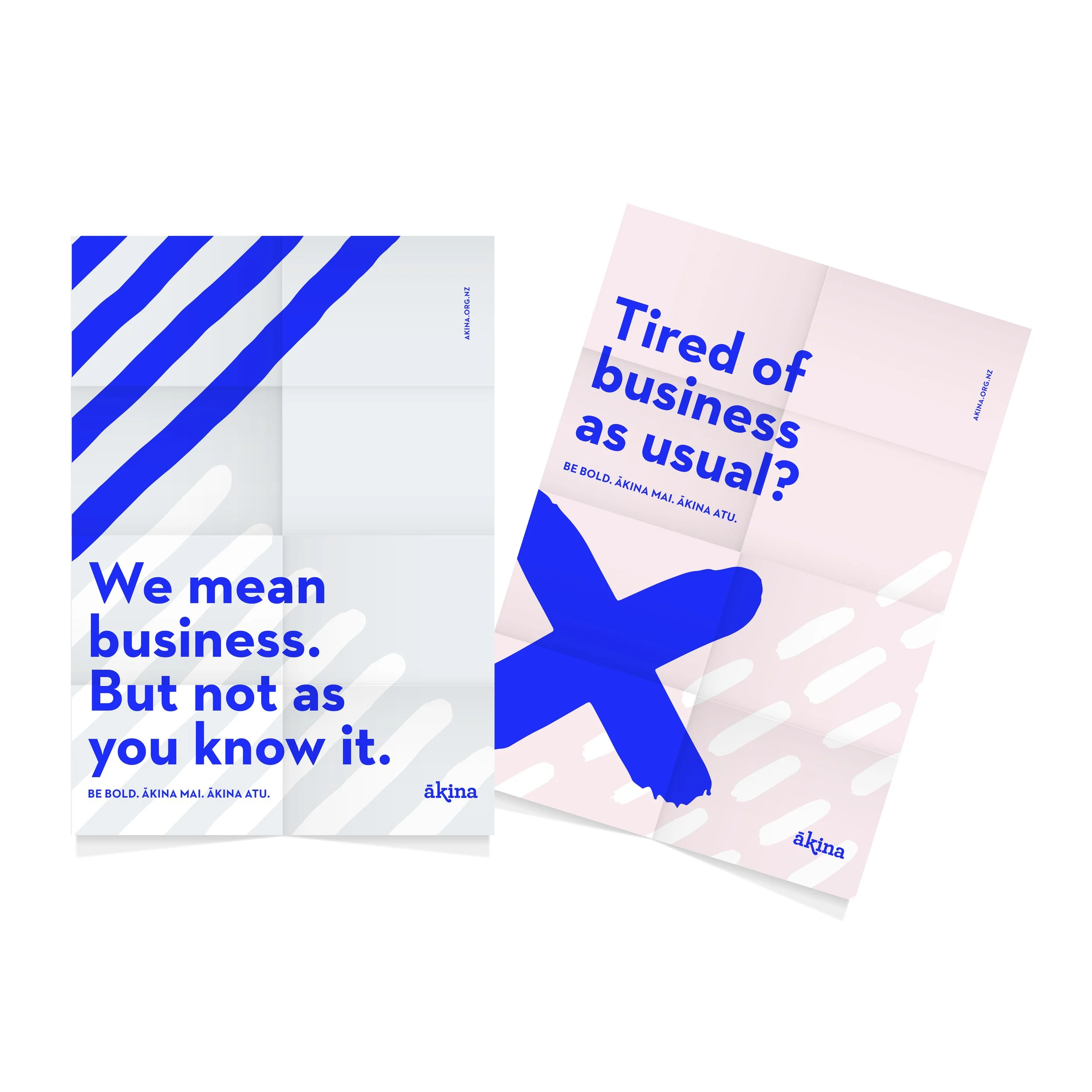
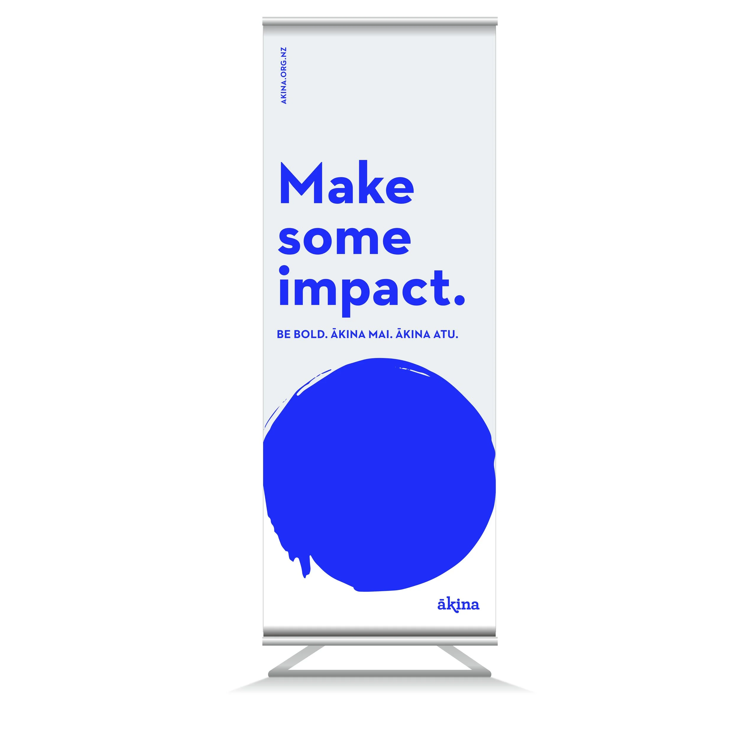
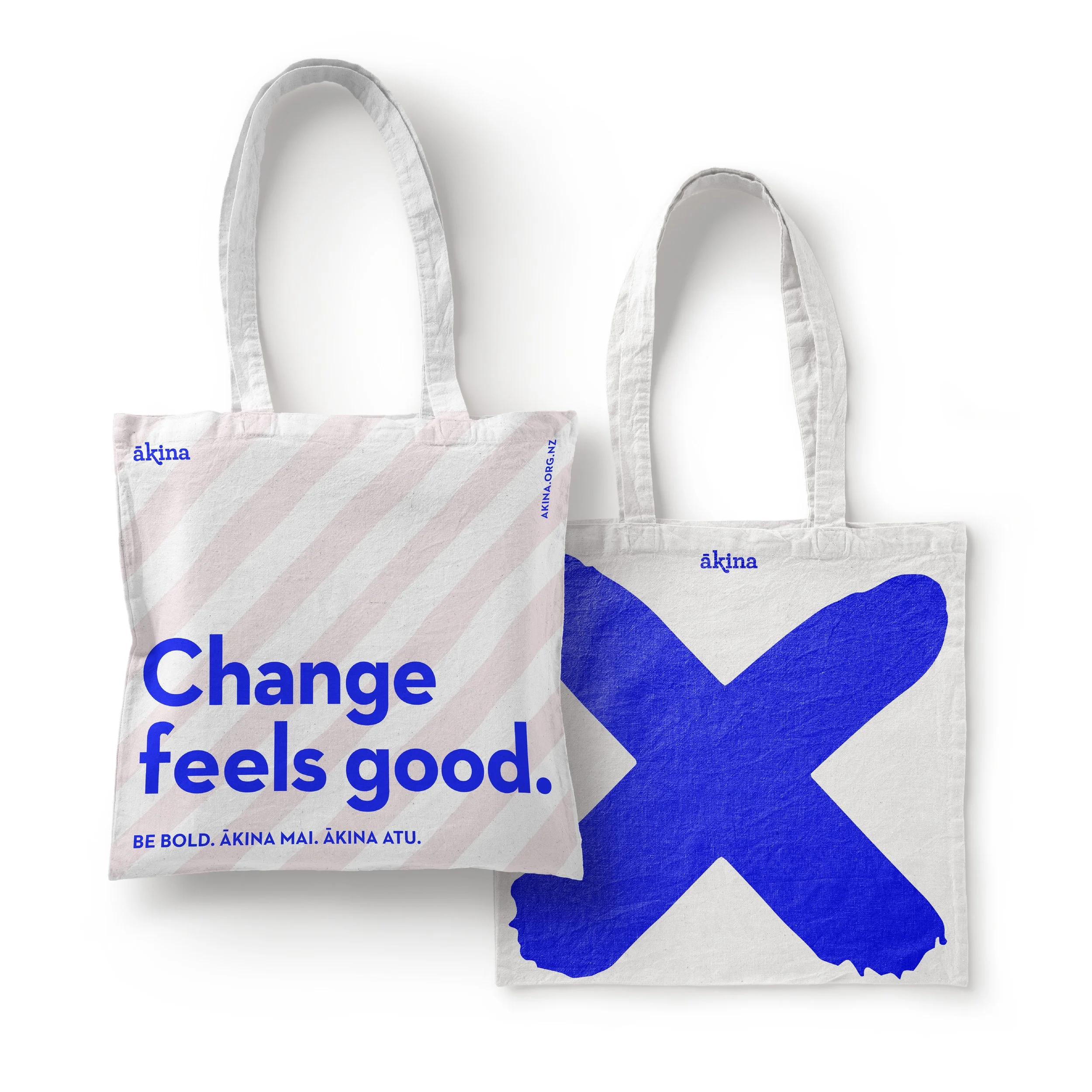
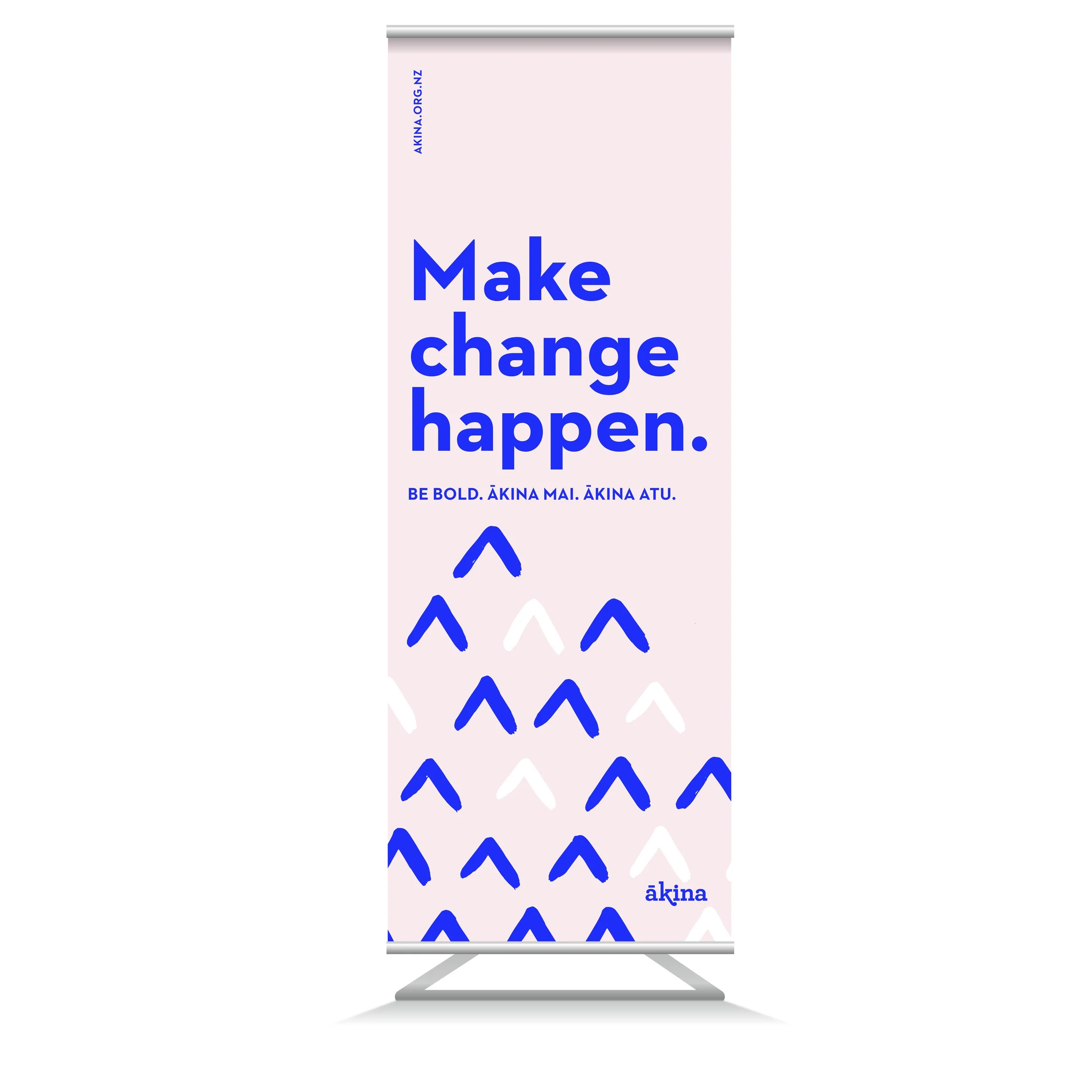
BRIEF: To assert Ākina’s position as the pioneers of social enterprise and impact in New Zealand. To refresh the brand so that it sits comfortably in the world of corporate consultancy, with a strong point of view and approach.
APPROACH: We created a brand that reflects the meaning of Ākina – “to challenge; to encourage; to urge onwards” which is a powerful call to bold action. We brought this to life with the bold use of colour and pattern. Strong, clear typography adds a level of authority. Our headlines are inspiring and empowering, and they belie Ākina’s expertise in a straight-up, professional way.