Whiri
Branding
Art Direction
Naming
BRIEF: To build a brand that will disrupt and challenge a ‘set in its ways’ commercial property industry through mana-enhancing, best in industry partnerships.
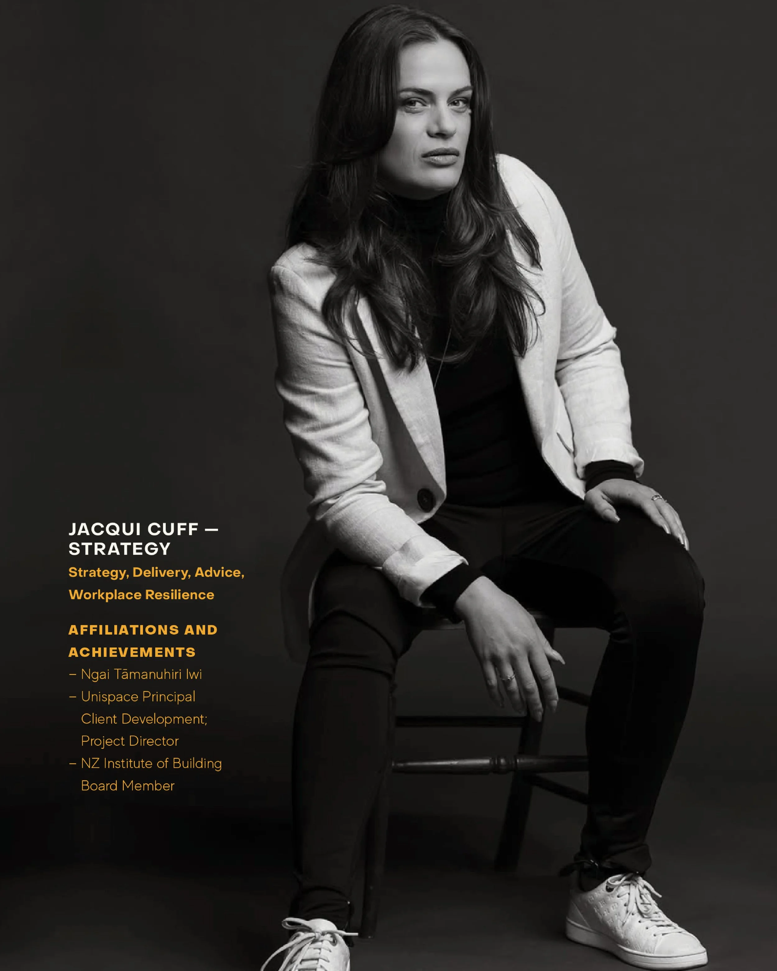
APPROACH: Founder Jacqui Cuff wanted to draw on her whakapapa in shaping her vision for her commercial property project management business. We brought in a Māori creative strategist and artist to help delve deeper into her history, the legends surrounding her ancestors and how those stories might inform her approach.
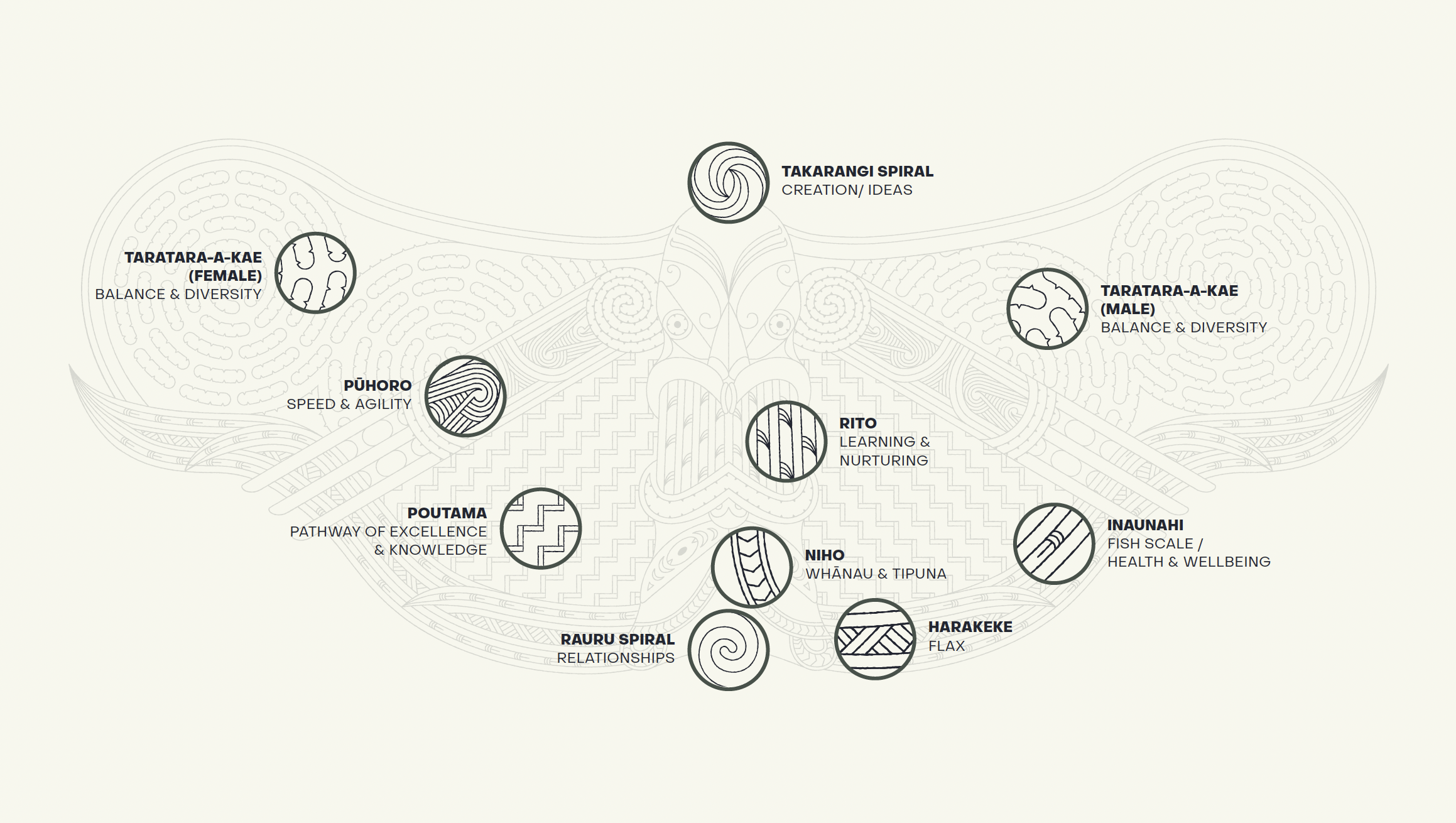
What we unearthed were a set of values: Tutū – disruption and innovation; Manaakitanga – care and support of others; Kotahitanga – a oneness that drives us together; & Mohiotanga – we bring a wealth of knowledge and insight to the table.
These values aligned in the pūrākau (legend of) Maui capturing the sun using a rope made by his sister from her own hair. This story speaks of the threads that bind, the power of togetherness and the ability to create our own horizons. It also talks to the idea that to make change one needs to challenge the status quo and strive for innovative, inventive and downright cheeky thinking.
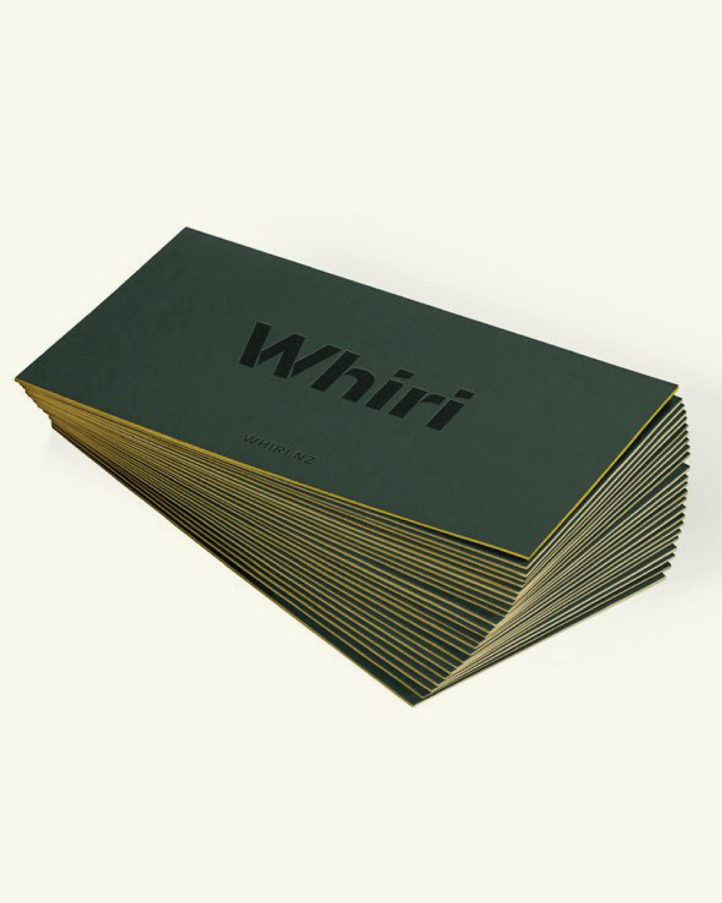
The name whiri means ‘to weave’ – representing how Jacqui brings together people with specialist skills to make a project stronger with care and support. The letter forms in the Whiri logo are inspired by the folding of flax when woven.